top of page

SELECTED WORK
Meadow Snacking Company
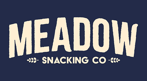
A nostalgic, organic brand identity system for Meadow Snacking Company, built around a sun-baked color palette and simple, earth-born botanical graphics. This cohesive visual framework utilizes a heavy, textured block wordmark to establish a comforting, free-spirited personality, naturally rooting healthy, granola-based snacks in the raw, tranquil serenity of the great outdoors.
[Role: Lead Graphic Designer]


The Problem
Modern snack aisles are flooded with over-processed energy bars packed with synthetic ingredients, wrapped in loud, neon plastic that feels entirely disconnected from nature. Health-conscious consumers looking for clean fuel are forced to choose between clinical, hyper-engineered sports nutrition or bland, uninspiring health foods that fail to capture the refreshing, revitalizing spirit of the actual outdoors.
The Solution
Meadow Snacking Company provides a nostalgic return to honest, whole-earth nourishment with simple, granola-based snacks made from real ingredients. Bound in a warm, textured, and deeply comforting visual identity, the brand serves as a bridge to the tranquil serenity of nature, delivering wholesome, free-spirited fuel that satisfies the body and grounds the soul in the raw beauty of the great outdoors.


BRAND ELEMENTS
COLOR PALETTE
#232B49
#FFEFD3
#1FA079
#DE6E26
#8B8AAE
TYPOGRAPHY

BLACK & WHITE

FULL COLOR IDENTITY
MAIN WORDMARK

FLAVOR COLORS


FLAVOR ICONS


PACKAGING DESIGN


bottom of page